![]()
Google Stitch ベータ刷新まとめ|無限キャンバス・DESIGN.md・Prototypes・MCPを実画面で検証
📝 記事について: 唐揚げブラウザという拡張を作った一連の流れのなかで、Stitch の仕様がどれだけ先へ進んだか、ひしひし伝わってきます。デザイナー目線は分かりませんが、開発者の私から見ても、かなり手の込んだ出来だと思います。
自然言語で触れるのに加え、特に DESIGN.md は「設計をここまで言葉に寄せられるのか」と感心しています。感性が効く領域なのに、意図を文章化してここまで進められることには、いまだに驚きがあります。
今回は要点だけに絞り、文字は控えめ・キャプチャ多めにしました。物足りなければ大目に見てください。内容の正確性は、必ず公式情報やデータソースでご確認ください。
Stitch は、自然言語から UI を作るツールから、アイデア探索・デザインシステム管理・プロトタイプ接続までを1つのキャンバスで進められる設計ワークスペースへ進化しました。
本記事は公式ブログと実画面の観察を合わせ、今どこまでできるかを短く整理します。
Core Insights
① 生成して並べる → ② Design Systems で方向を定める → ③ Prototypes でつないで検証する
-
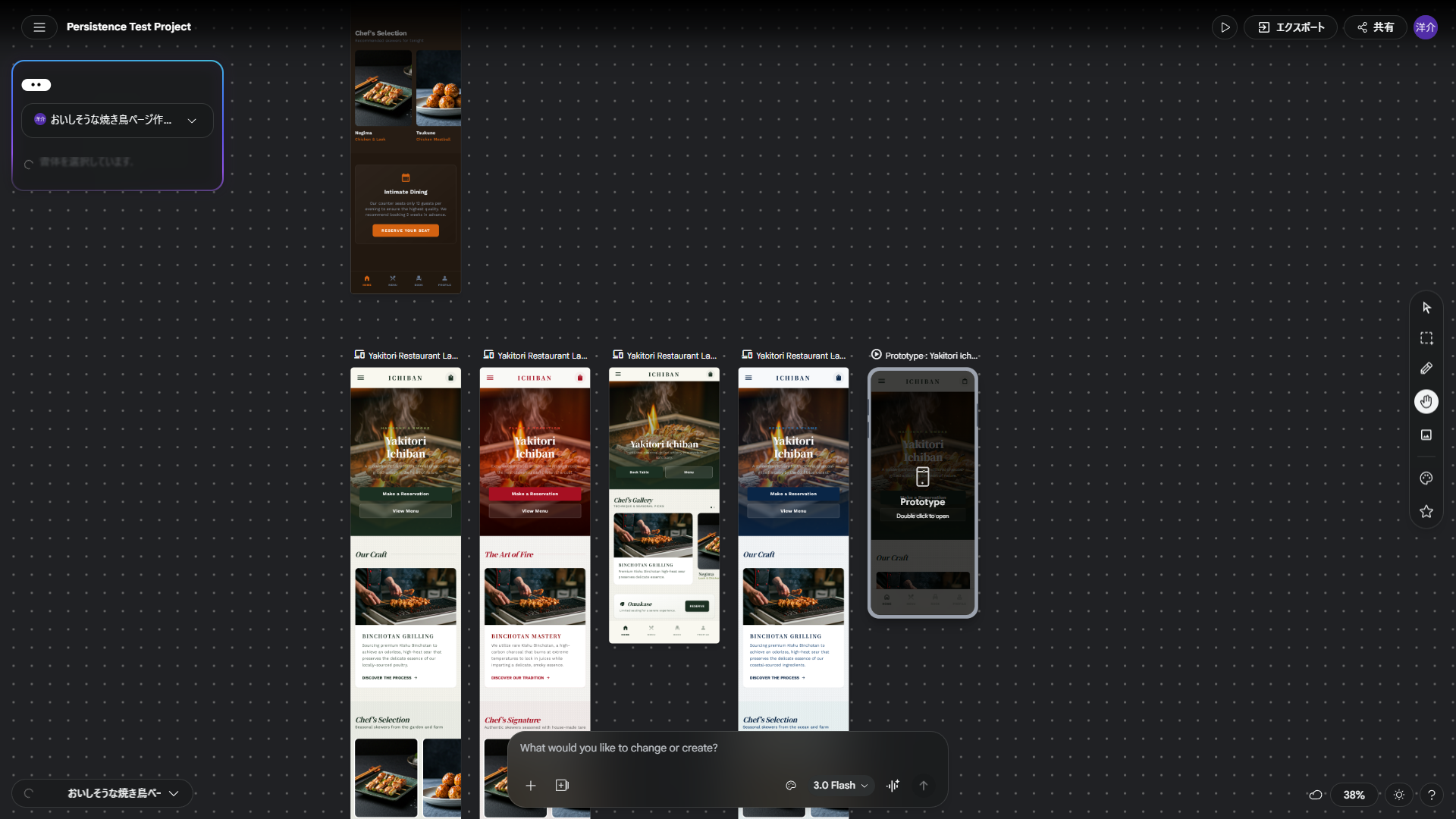
1 探索
無限キャンバスで複数案を同時に比較
1ページに複数画面を置いて、方向性をすばやく検証できます。
-
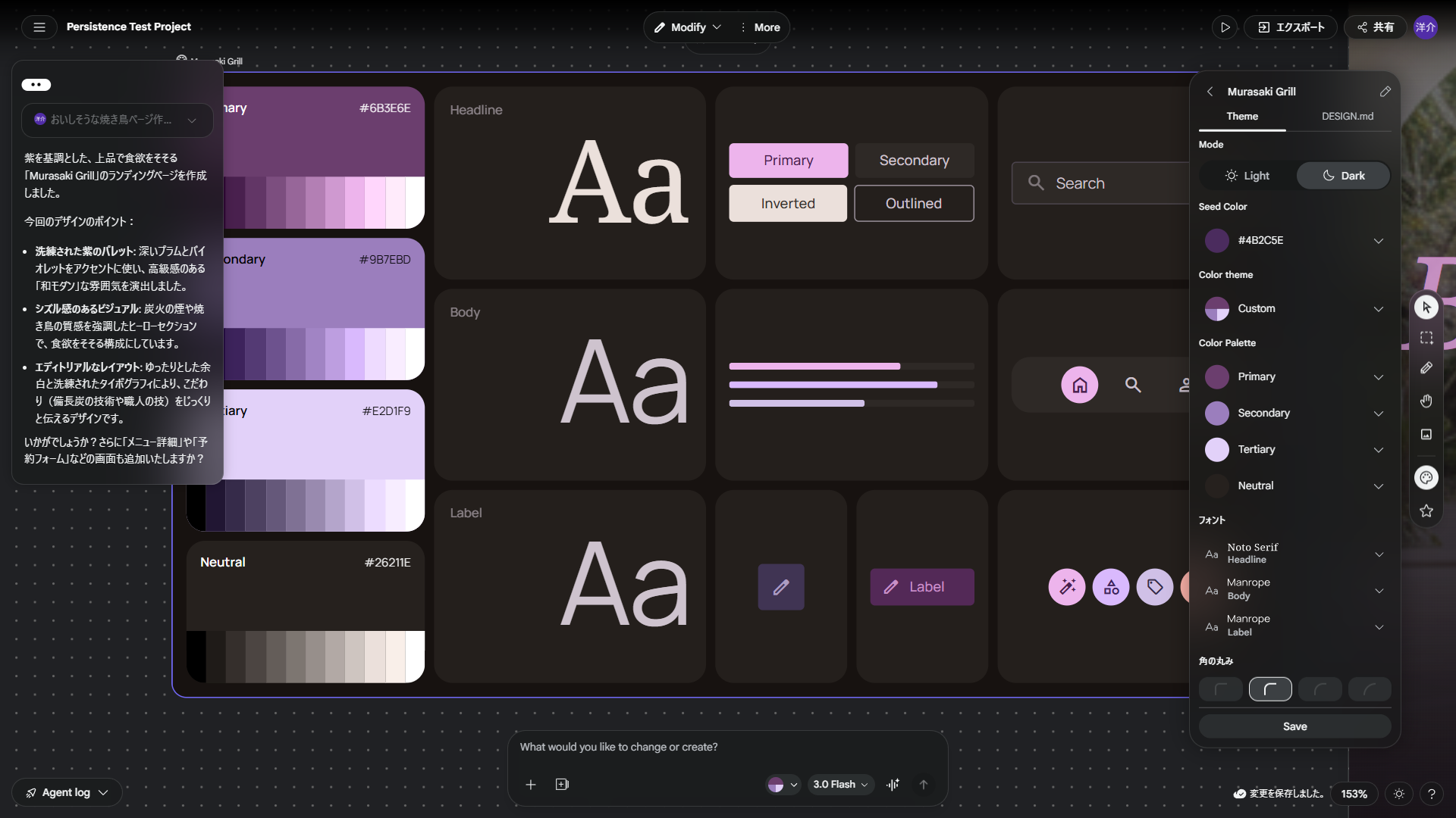
2 統一
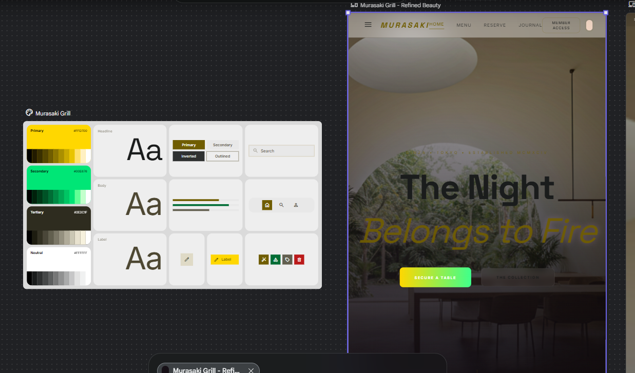
Design Systems と DESIGN.md で設計意図を固定
Theme 設定と自然言語ルールを分けて管理し、再利用しやすい形にできます。
-
3 接続
Prototypes と MCP で検証から連携へ
画面遷移を試しつつ、MCP/SDK で自動化フローにもつなげられます。
Stitch ベータで何が増えたか
公式ブログでは、Stitch を AI ネイティブな設計キャンバスへ進化させる方針が示されています。ポイントは、無限キャンバス、設計エージェント、Design Systems + DESIGN.md、Prototypes、音声操作、MCP/SDK 連携です。
ここからは、実際の画面キャプチャを使って、観察できる範囲で機能を整理します。公式に明記された内容と、UI観察の内容は分けて書いています。
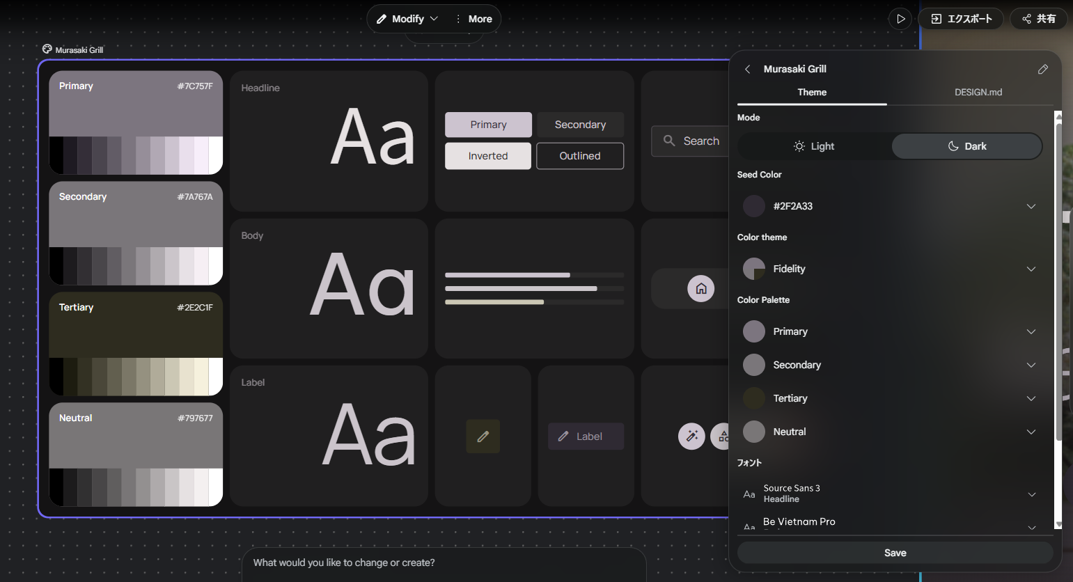
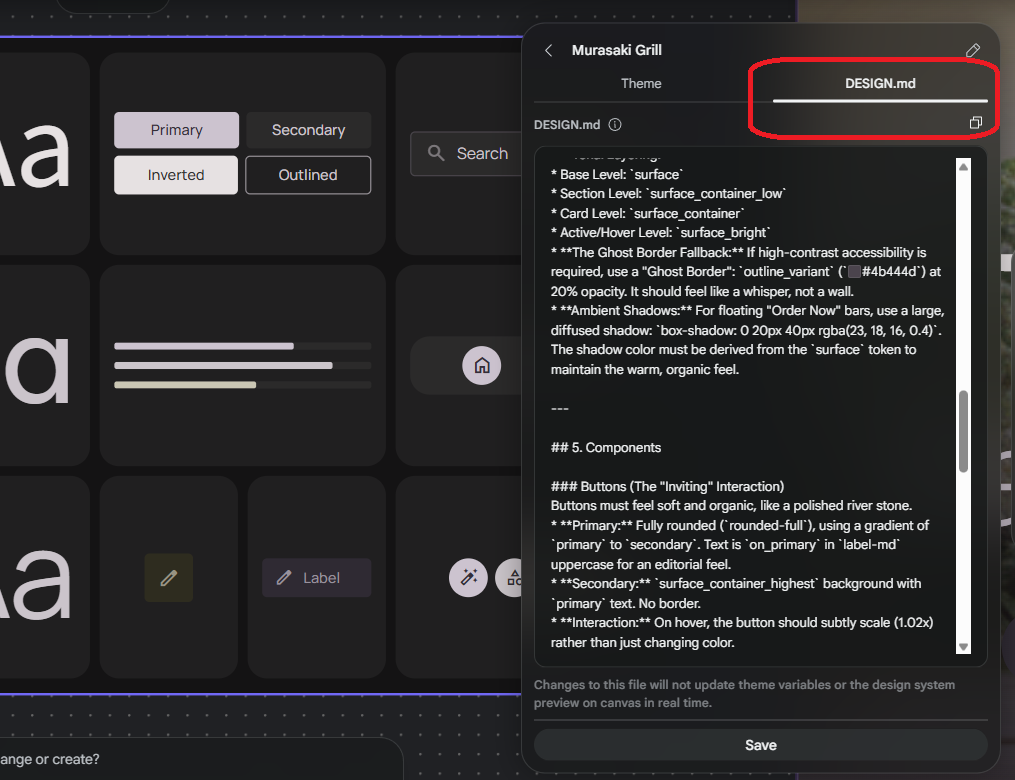
DESIGN.md エディタ下部には、編集内容が Theme の変数やキャンバス上のプレビューをリアルタイムには更新しない旨の注記が表示されることがあります(画面観察)。保存や反映のタイミングは UI の挙動に合わせて確認してください。
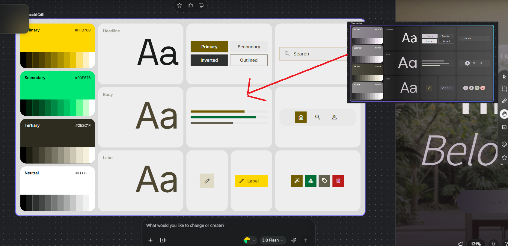
DESIGN.md 実験(今回の変更意図)
背景: 黒(#171210)→ 真っ白(#FFFFFF)
雰囲気: 静かな隠れ家 → 元気なカフェ・スポーツジム
ボタン: 紫の丸い石 → 黄色の元気な四角いボタン
レイアウト: 雑誌風のバラバラ配置 → きっちり並んだグリッド配置
実験で貼り付けた design.md 全文(英語)— クリックで開閉
Sure! Let’s flip the script entirely. Since the original was dark, moody, and "slow" (like a quiet Tokyo night), let's create a design system that is bright, energetic, and high-speed.

Think of a "Sun-Drenched Juice Bar" or a "High-Energy Health App" in the middle of a bustling city at noon.

Design System Strategy: The Neon Garden
1. Overview & Creative North Star
Creative North Star: "Electric Vitality"
This system rejects the "recessed" and "quiet" look for a high-energy, high-contrast experience. It’s designed for speed, clarity, and health. The aesthetic centers on The Neon Garden—where bright, citrus-inspired pops of color sit on a crisp, pure-white canvas. It feels fresh, urgent, and optimistic.

2. Colors & Surface Philosophy
The palette is built on "Sunlight" and "Vibrancy."

The Hero Palette:

Primary (#FFD700 - Solar Yellow): Used for primary CTAs to grab immediate attention.

Secondary (#00E676 - Neon Mint): Used for success states and health indicators.

The Pure Base: surface is absolute white (#FFFFFF). We want the interface to feel like it’s glowing with natural light.

The "Bold Border" Rule: Unlike the "No-Line" rule, we use clear, 2px solid strokes (#F0F0F0) to define cards. This ensures the user knows exactly where one piece of information ends and another begins.

3. Typography: The Pulse of the City
We use bold, approachable fonts that scream "Read me now!"

Display & Headline (Poppins): A geometric, thick sans-serif. Use display-lg (3.5rem) with Extra Bold weights to create a sense of urgency and confidence.

Body (Inter): A highly legible font designed for small screens. High X-height to make sure ingredients are easy to scan while walking.

Editorial Hierarchy:

Dish Names: Bold, black, and loud.

Prices: Large, highlighted with a secondary_container background chip to make them pop.

4. Elevation & Pop
Elevation here is about "Bouncing" and "Playfulness."

Flat-Plus: We don't use soft, realistic shadows. We use "Hard Shadows" (2px offset, 0 blur) to give a 2D, sticker-like feel to buttons.

Micro-Interactions: Elements should "pop" (scale 1.1x) when tapped, giving the user instant tactile feedback.

5. Components
Buttons (The "Call to Action")
Primary: Squircle shape (rounded corners, but not a pill). High-contrast black text on Solar Yellow.

Interaction: On hover, the button should shift its hard shadow to look like it’s being pressed into the screen.

Cards (The Grid Gallery)
Strict Grids: No asymmetry here. Everything sits in a clean, 2-column grid for maximum scanning speed.

High Saturation: Food photography should be bright, over-saturated, and shot in "top-down" flat-lay style.

6. Do’s and Don’ts
Do:
Do use bright, "Zesty" colors like orange and lime.

Do use emojis in headers to add a friendly, human touch.

Do maximize white space to keep the "Fresh" feeling.

Don’t:
Don’t use gradients. Stick to flat, solid "Power Colors."

Don’t use italics. They feel too "old-fashioned" for this high-speed system.

Don’t use any color darker than a mid-gray for text.

7. Spacing Logic
The spacing is Compact and Mathematical. We use a strict 8px grid. Section padding is 8 (2rem) because we want more content on the screen at once. It’s about efficiency, not "breathing room."
実際に貼ったファイルは design.md(英語の長文)です。上の4行は狙いを日本語で圧縮したメモです。Design Systems は「機能パネル」として開く UI で、通常のページとは別レイヤーで管理されます。
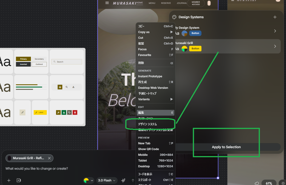
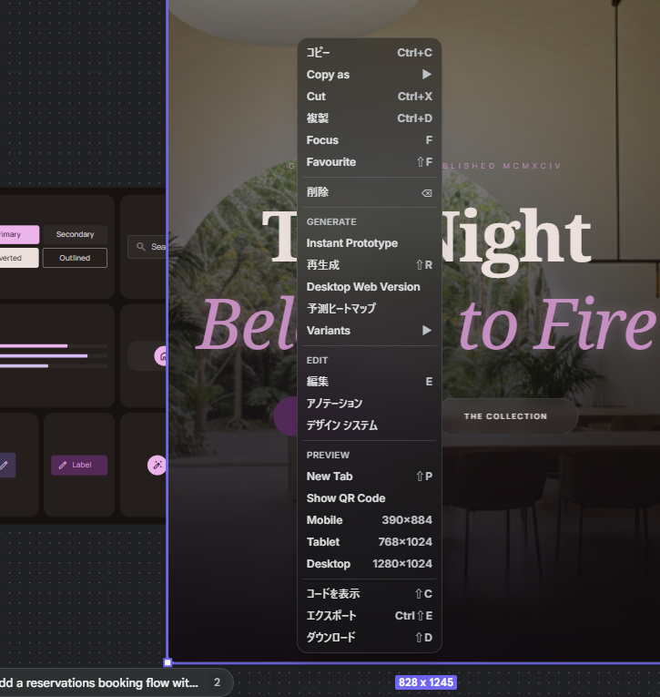
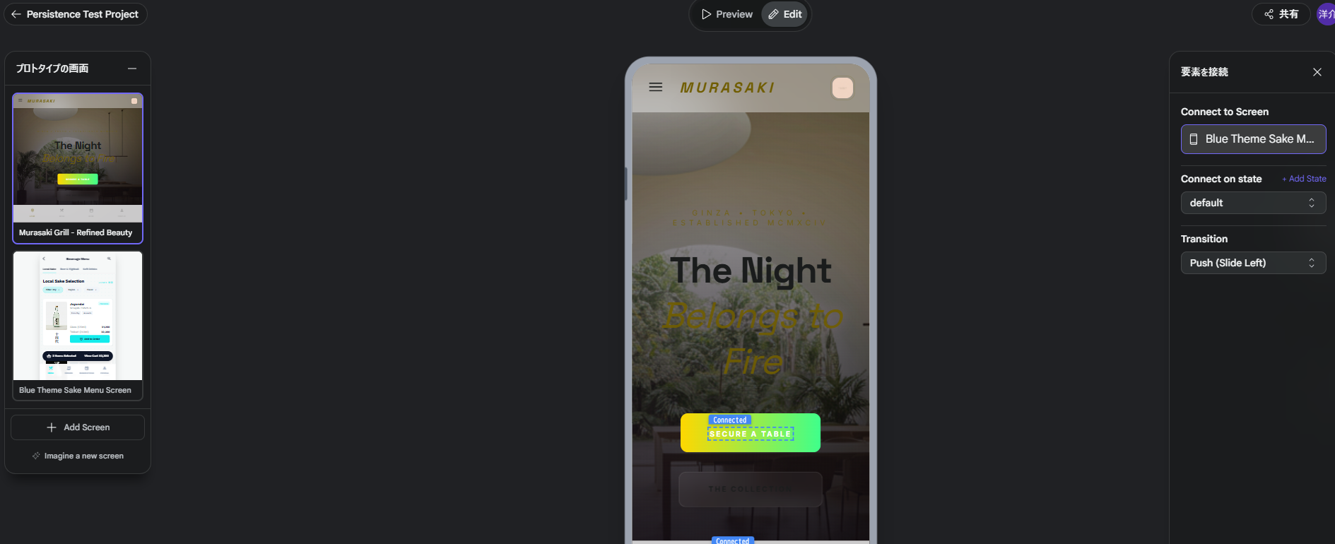
Prototypes でシーン接続
プロトタイプモードでは、画面要素ごとに接続先スクリーンと遷移を設定できます。今回の観察では、右パネルに Connect to Screen・Connect on state・Transition が表示され、接続フローを作りやすい構成でした。
左サイドには Imagine a new screen のような、新規画面生成に進む導線も見えます(UI観察・公式の文言は画面に依存)。
MCP でできること
Stitch の MCP サーバは、エディタやエージェントから「ツール呼び出し」でプロジェクトと画面を操作します。GUI で試した流れを、同じアカウント権限のままスクリプトやチャットボットに載せ替えられるのが位置づけです。
以下のツール名と役割の一覧は、Google 公開の @google/stitch-sdk が MCP マニフェストから生成している toolDefinitions(2026-03-19 生成版)に合わせています。追加・改名がある場合は MCP reference(公式) および stitch-sdk を優先してください。SDK では listTools() で実行時に一覧取得もできます。
| MCP ツール名 | できること(概要) |
|---|---|
create_project |
新しい Stitch プロジェクト(画面のコンテナ)を作成。title は任意。 |
list_projects |
アクセス可能なプロジェクト一覧。filter で view=owned(既定)/view=shared など。 |
get_project |
1件のプロジェクト詳細を取得。name は projects/{projectId} 形式。 |
list_screens |
指定プロジェクト内の画面 ID 一覧。projectId は projects/ なしの ID。 |
get_screen |
1画面のメタ情報を取得。応答に HTML・スクリーンショット用の取得導線が含まれる(SDK の getHtml() / getImage() はこれを利用)。 |
generate_screen_from_text |
プロンプトからそのプロジェクトに新規画面を生成。projectId・prompt 必須。任意で deviceType(MOBILE / DESKTOP / TABLET / AGNOSTIC 等)、modelId(GEMINI_3_PRO / GEMINI_3_FLASH)。 |
edit_screens |
既存の複数画面を、同じプロンプトで一括編集。selectedScreenIds に画面 ID の配列(プレフィックスなし)。 |
generate_variants |
既存画面のバリエーションを生成。variantOptions で件数(1〜5)、creativeRange(REFINE / EXPLORE / REIMAGINE)、変化させる aspects(LAYOUT, COLOR_SCHEME, IMAGES, TEXT_FONT, TEXT_CONTENT など)を指定。 |
運用で効く要点(公式ツール説明の要約)
- 生成系は待つ・すぐリトライしない —
generate_screen_from_textとedit_screensは完了まで時間がかかる旨がツール説明に明記されています。接続エラーでも処理が進んでいることがあるため、必要なら後からget_screenで状態確認、という流れが推奨されています。 - 識別子の形式 — 多くの引数で
projectIdは数値 ID のみ(projects/なし)。get_project/get_screenのnameはフルのリソース名(例:projects/…/screens/…)。 - HTML・画像 — 専用の
fetch_*ツール名は上記マニフェストには無く、get_screen経由(および SDK のラッパー)でダウンロード URL を扱う想定です。 - 認証・接続 — API キーやクライアント設定は MCP setup/MCP guide に従ってください。
Artist's Perspective
金曜……気づけばもう金曜。もともと使っていたスマホの通信が不安定になったので、ネットで「壊れているが使えそう」と出ていたジャンク品を見つけ、格安で手に入れた。電波はなんとなく繋がるが、画面が読みにくい。ジャンクの味である。いつ途切れるか分からない(笑)。
月550円の格安プランで、いまのスマホ代はなんとか保っている。それでも本体の出費ひとつ、近頃は一瞬ためらう。
ソメイヨシノの開花宣言が、あちこちで始まった。お花見なら、やはり千鳥ヶ淵かな。
データソース・参考リンク
本記事は以下の情報源を参考にしています。内容の正確性については、必ず元のデータソースをご確認ください。